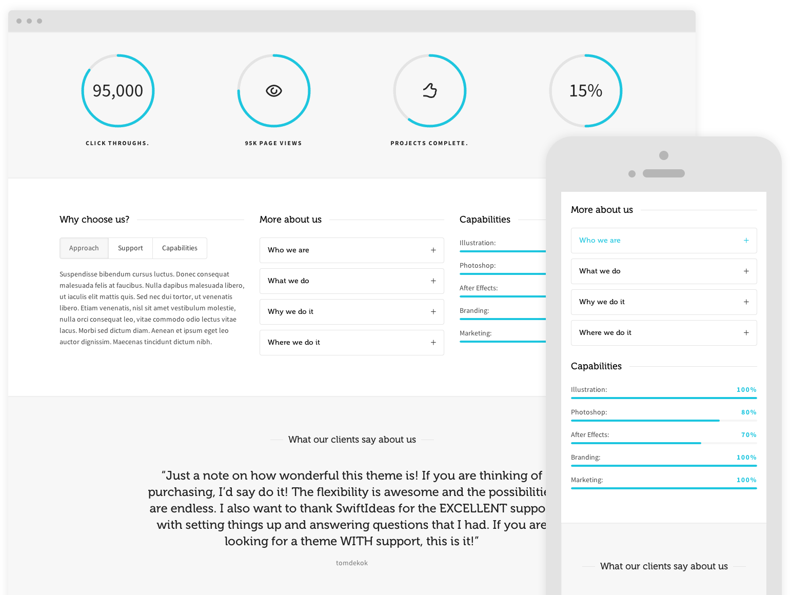
Desktop view
To the right is an example of content that’s perfect for desktop viewing, but not particularly well suited to tablet viewing and mobile devices.
Re-size your browser to see how our responsive visibility shortcode allows you to show/hide content.

Tablet view
Ok, so no we’re at Tablet size you’ll notice the image to the right has changed. This is one is more suitable for tablets.
Keep re-sizing to see the phone specific content.
Phone view
Now we’re at phone size we’ve decided that we shouldn’t use an image. With this handy shortcode your content will always be device appropriate. So… are you impressed?


